About Our Design Agency
Dexterous Designs Studio in Taunton. Websites & Design
In 2020, the Dexterous Designs Studio in Taunton decided to make some changes to our brand and appearance. We have grown the team and the professional business services we offer over the last few years, and really wanted to shake-up our website and visual branding to reflect the excitement and energy of our studio!
As with any business, the brand can appear to become dated over time – and with the nature of our business it’s imperative for us to have a brand that reflects our expertise, and that will really engage with the types of businesses we want to work with.
The company was founded in 2014, and the brand had remained the same since then. We loved the fact the logo mark had become recognisable and synonymous with our company, so retaining this was essential.
The planning, development, concepts and realisation took months of hard work, and the new brand was rolled-out towards the end of 2020. We are extremely proud of what has been achieved with our efforts and skills.
We wanted to evolve our current logo to fit with our new ideas for expanding the business into other areas, resulting in a brand that feels modern and considered.
Re-Drawing The Logo
We made the decision work with the existing logo mark and challenged ourselves with the task of re-drawing and modernising this, whilst still keeping a logo that our clients recognise.
We now have a single colour Identifiable logo mark, which we will be using a stand-alone identifier of the brand, free from text. We feel the ‘dd’ is strong enough to communicate who we are, and that adding text and/or other design elements to this will subtract from the impact this has.

Colour
Colour was a big focus, we wanted to move away from the limited palette of white, blue and black. Moving towards a group of colours that created a more diverse feel.
The base colours used are intended to keep a neutral feel to allow the more vibrant ‘Service colours’ to stand out without conflict.
The Dark ‘Main Blue’ colour, used for Headings and background sections, has been chosen over black/grey, to compliment the rest of the palette.

Texture / Pattern
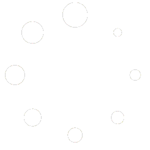
We searched for a pattern that reflected how we saw ourselves ‘Dexterous’ Fluid. The concept that our 7 new brand colours all relate to an overarching service we provide – Light Blue = Websites, Mid Blue = Graphic Design etc.
The pattern brings all of those elements together to represent all the amazing professional services that we offer as a team, and gives an extremely eye-catching and engaging visual feel.

Typography
The project also gave us the opportunity to rethink the brand typography.
A typeface was chosen that needed to be clean and readable with excellent legibility, To pair with a strong typeface that both contrasts and compliments. We went with the tried and tested pairing of Montserrat & Open Sans.

Assets & Application
As with all branding projects and re-designs, the key is where the branding will be seen and how it will be used. Considerations around social media, digital and printed marketing materials all need to be thought about.
Our office space was also a key space that needed a refresh and we decided to add another element to this be employing the use of a local artist, to create a mural wall using our new brand palette, based on our fluid pattern concept.